True Summer Colors - Complete Guide
Complete guide to True Summer colors, palette direction, and color combinations for the coolest and most balanced Summer season.
True Summer Color Palette
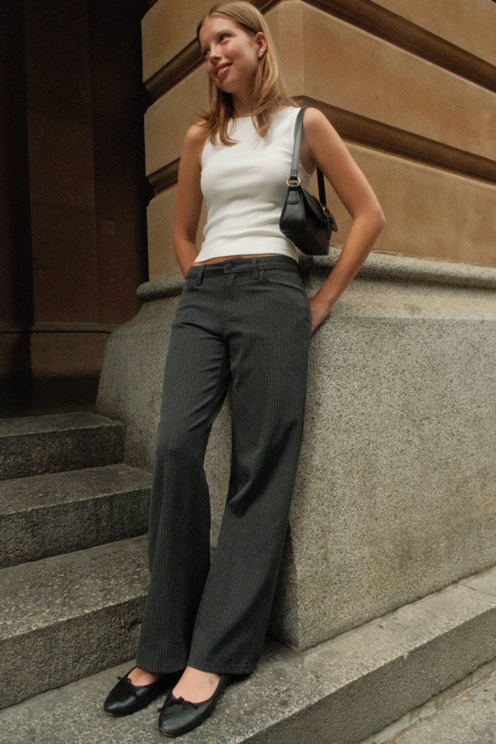
True Summer colors are the coolest and most classic of the Summer family: roses, taupe, Gainsboro, slate grey, bellflower blues, porcelain blue, sea green, and soft violets. The palette is elegant, clearly cool, and refined rather than sugary or earthy.
Recommended Color Combinations
The strongest True Summer outfits stay cool and composed. Build around silvered neutrals or classic blue families, then add one rose, bellflower, or sea-green accent to keep the look polished.
True Summer Palette Generator
Start with a cool blue, rose, or grey anchor and generate palettes that stay elegant, balanced, and muted instead of warm, dark, or electric.
Base Colors
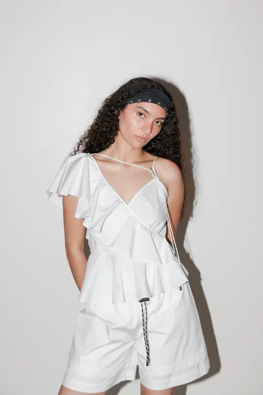
Use for major pieces, statement items, dresses, and blazers.
Neutrals
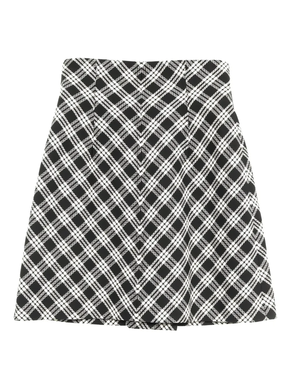
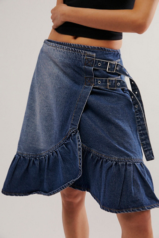
Use for everyday basics, pants, skirts, and foundation pieces.
Accents
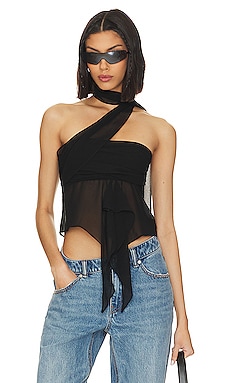
Use for accessories, tops, jewelry, and controlled pops of color.


Clothing Recommendations are generated using the palette above. Select a different season, hue, or combination controls for different options.
True Summer Characteristics
True Summer, called Cool Summer by Dream Wardrobe, is the most balanced and coolest of the Summer palettes. It keeps the typical Summer softness, but the colors feel cleaner, cooler, and more classic than Light Summer or Soft Summer.
Physical Features
- Eyes: Light grey, blue, azure, or light green
- Skin: Beige or pink skin with clearly cool undertones
- Hair: Dark ash blonde through light ash brown to dark ash brown
- Overall: Medium contrast with a cool, elegant, softly blended effect
Color Qualities
- Temperature: Fully cool, with no need for golden warmth
- Saturation: Muted and watercolor-soft rather than bright or icy
- Contrast: Medium contrast that stays refined instead of dramatic
- Avoid: Warm orange-browns, yellowed neutrals, and very sharp winter brights